
I’ve been learning Pardot, prepping for the exam, doing all the things.
But I can’t help comparing it to Marketo. For obvious reasons. Marketo was, you know, my first. Marketing Automation Platform. My first Marketing Automation Platform.
One thing I know is that there are very few comprehensive comparisons between the two platforms. Which I get. This has taken me some time. I’m still uncomfortable with the idea. There is bias to contend with. But it’s important and a little therapeutic to go through this process, so here I am.
This will be a series, as comprehensive as I can manage, based on different aspects of Marketing Automation, in which I will compare the two. In each round, I will give the platforms a rating from 1 to 10. At the end, I’ll do a brief overview and announce the winner!
Please keep in mind: this is largely subjective!
In Round 1, I take a look at the UI of each system, considering its ease of navigation, organization, look and feel, and even diction choices.
Home Screens
First impressions are important. What is available to you when you first log into these systems?
Marketo
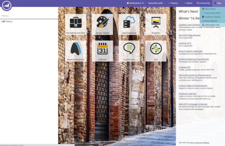
First logging into Marketo, you have a few options. You can utilize the tiles to navigate to the space that you want, or you can click on the logo to the left and select from the drop down. You can go to the Admin area, navigate to the community, and you can see any Marketo alerts – such as release notes – on the right.
There isn’t a ton of information here; it serves a the nexus, from which you can go anywhere. It is simple.
Pardot

We open onto the Dashboard here. We have an announcement, can see our prospects, and scrolling down we get to our Marketing Calendar, a list of Prospects that need to be reviewed, and a list of Identified companies. Navigation is there on the left, and we have some options up top.
Overall, not a bad way to start. We have a lot of information at our fingertips here.
The one thing I’d say is, as someone who lived in MA for a few years, having the Marketing Calendar front and center really would be more beneficial. I don’t always need to know how many Prospects we’re bringing in, but I really do need to know what’s coming up next.
Navigation
Navigation is how a user can get to where she or he needs to go – is it intuitive, or are there strange cutbacks in the road? I grew up driving in the mountains, so having a winding and twisting way to a place isn’t necessarily a bad things…unless, of course, we’re discussing software. It shouldn’t take more than a few clicks to get to where you need to go. Let’s pull back the curtains and take a look…
Marketo
Navigating Marketo happens in two places: in the left panel for operations, and at the top for administration.
Options are structured relatively simple: Marketing Activities holds all – you guessed it – marketing activities; Design Studio is where you keep templates and content; the calendar is where you keep your calendar, etc.
Once within a “parent” section, your folders, sub-folders, options, all take up residence in the left side panel. There is not a way to minimize that panel, so it does reduce real estate on the page, but most design editing happens in pop-up windows, anyway.

When creating automation, options appear in a right side panel (not pictured).
Admin, Help, and Community portals all stay at the top of the page.
Marketo gives relatively few options for basic navigation, but that keeps it simple, much like their home page. It takes generally two clicks to get to the area you need, but it might take more to get to any specific folder or item, depending on how you’ve set up your own organization.
Because of that, it can feel crowded. It takes a lot of tribal knowledge to navigate through the Programs, folders, and Campaigns of Marketing Activities, for instance. Since each instance is a little different, it can be daunting to go from one org to another.
Overall, however, getting to the right place is easy.
Pardot
Like Marketo, Pardot navigation exists on the left, with portal or settings links at the top.
Unlike Marketo, their navigation panel can be minimized. It is also nested; a user cannot simply click on Reports and be taken to a list of options. S/he must hover over Reports, then select the specific subgroup. Depending on what the user is looking for, it might be nested three deep.
In this way, navigation requires fewer clicks, but I find it easy to get lost. Back to my Reports example, if I want to run a report of Prospects, and I hover over the Reports tab, I have the following options:

Joke’s on me! I have to go to Prospects to see a list of my Prospects. I can see a Conversion report, or I can look at a Lifecycle report – both of which are related, but maybe neither is what I’m looking for.
Having relatively few options is good; users don’t need to be bogged down with having to remember where to go.
But the navigation is deceptive. It looks easy until someone hovers over one of the options and is met with all of the real options.
I’ll admit that since Pardot is still new to me, it could be me, but navigation isn’t so intuitive to here. The way it’s organized mostly makes sense, don’t get me wrong – if you hover over Marketing, then Email, you get options for templates, drafts, sent emails, etc. Unfortunately, that’s the only way to get to those things. If I click on Emails, it takes me to a page with some stuff, but not all of it.
Following the bread crumbs can get you to very specific areas, so long as you don’t mind following the bread crumbs.
Naming Conventions
Every Marketing Automation platform is a little different, and that includes what they call things. I touched on that a little bit in my Midwest Dreamin’ presentation. What’s important is that people using the software know what those things are.
Marketo
Depending on your edition of Marketo, some options may not be there. The core options are the same, though – Marketing Activities, Design Studio, Lead Database, Analytics, Calendar, Community, and SEO.
None of those things are confusing to me; they’re all relatively straightforward.
I’ve written about this one before (and it was subsequently explained to me!), but the only kind of confusing thing is that they call the container for a marketing initiative a Program, and the automation pieces are called Campaigns.
Honestly, why did I even make this a subcategory? Who can say?!
Pardot
4 options – Marketing, Prospects, Reports, and Admin. The sub-menus are similarly easy to understand.
Seriously – having typed this, I think this one is obvious.
Overall Look and Feel
Both platforms have simple, clean layouts.
Marketo utilizes a series of images of streets and buildings, which, honestly, I don’t really get, but it’s a nice change of pace.
Pardot is blue and white. That’s it. It keeps it simple and consistent, but there’s definitely no pizazz there.
Summary
In the current world of technology and IoT and all of the fancy things out there, it’s unacceptable to have a bad UI. There are UX jobs out there, even! I started here because it was both the easiest and the hardest.
Scoring between the two is like a difference of 1%, if that. But it can’t be a tie because this a cage match.
So, based on ease of navigation and a little more flair, this round goes to Marketo.

BOOM! Round 1 winner! Woohoo haha.
Looking forward to round 2… Cool post
Sent from my Cellular Mobile Wireless device
Haha! I thought you might like it!